Autism Diagnosis Accuracy – Visualization Redesign
Kaiser at Junk Charts has posted an interesting challenge based on the question how to visualize an Autism diagnosis dataset in a better way (originally posted by Igor Carron at Nuit Blanche). I’m offering my own redesign of the data below, and discuss my different approach and what it tells us about the visualization of sets in general.
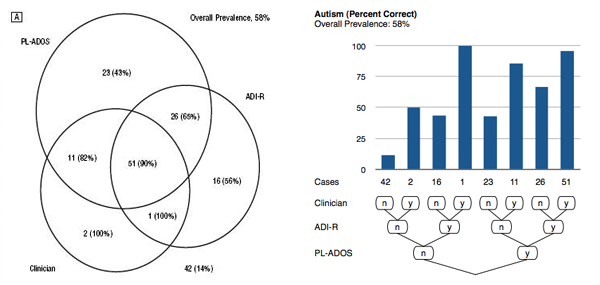
The original visualization of this data is shown below (click for a larger image in a separate window/tab). These Venn diagrams show the performance of three different early tests for autism (PL-ADOS, ADI-R, and Clinician’s assessment). There are two distinct questions here, autism itself and other autism-related disorders (called autism spectrum). The diagram itself depicts the number of children that got a positive diagnosis in any combination of tests, while the fraction of children who were later found to be autistic is indicated in parentheses.
The redesigns posted in the Junk Charts discussion are mostly focused on improving the Venn diagram, but I believe that the original version of the diagram is already flawed. What seems to be much more interesting than the number of children diagnosed with each combination of methods is the correctness of the diagnosis. The number of children serves mostly to measure the support, since all tests agreed only on a small number of children.
The Data
The basis for a redesign is a cross-tabulation of the data, which can be easily read from the figure. A cross-tabulation lists the combinations of all categories against each other, with their relative frequencies as the value. Because we are looking at three criteria here, the shape of the table is a little different – in fact, it looks a bit like a tree!
| PL-ADOS | ADI-R | Clinician | Number Autism | Percent Autism | Number Spectrum | Percent Spectrum |
| n | n | n | 42 | 14 | 17 | 12 |
| n | n | y | 2 | 100 | 2 | 50 |
| n | y | n | 16 | 56 | 9 | 44 |
| n | y | y | 1 | 100 | 2 | 100 |
| y | n | n | 23 | 43 | 7 | 43 |
| y | n | y | 11 | 82 | 7 | 86 |
| y | y | n | 26 | 65 | 21 | 67 |
| y | y | y | 51 | 90 | 107 | 96 |
| Total | 172 | 172 |
The root node of this tree is of course the entire data set, or the last row of the table. The tree splits into a yes and a no branch in every column. The columns Number Autism and Number Spectrum are shown in the Venn diagram above. But what we are really interested in are the percentages Percent Autism and Percent Spectrum. Also, the tree structure is implicit in the Venn diagram but very hard to read (in fact, I would argue that Venn diagrams are a great tool for learning about sets, but useless as a visualization).
The Redesign
The following images now show my redesign of the diagram. The percentages are shown as bars for easy comparison, while the number of cases for each combination of tests is shown as a number – since the absolute numbers are important here, that appears to be the best choice. Which tests indicated autism is shown by the tree diagram below the bar charts. This diagram should also clarify the brief explanation abive about the tree in the table above.
It is easy to see that there are significant differences in the accuracy of the combinations of the tests. Because they are roughly sorted from all-no to all-yes from left to right, there is an overall trend of the numbers getting better, but it is not very clear which combination of tests is the most effective.
One value that stands out is the left-most one: the one in which all tests were negative. This value should of course be as small as possible, because it shows the number of false negatives. All other bars show the correct positives.
We can sort the table by correctness, and get bars that neatly increase in height from left to right. Of course, some of the bars (especially the 100% ones) have very little support (one or two cases), so we indicate to the user that they should be disregarded.
Notice that in the images below, the order of test combinations from left to right is not identical (i.e., the autism and spectrum numbers were sorted independently), and the order of criteria in the tree levels has changed from the ones above – but is consistent between these two images.
The new order of tree levels is very significant, because the higher tree level (closer to the root of the tree) has a greater impact on the accuracy of the test than the lower levels. The clinician’s assessment thus is the most important criterion, followed by ADI-R and then PL-AIDOS.
What can we learn from this? Subsets defined by categories are effectively hierarchies. This is the reason why categorical data can be visualized so well using treemaps! And especially in this case, we are very interested in the hierarchy, because it tells us which of the tests contributes most to the accuracy of the diagnosis.
Below are PDF versions of my redesigns for closer inspection.
Posted by Robert Kosara on September 29, 2007
This content was originally published here.
